nathaly coutinho

product designer

london, uk

Status labels

About the project

Lawyers currently run deals using checklists they create in Word. In some cases, lawyers add colour coding to their checklists to indicate the status or progress of a particular document. Each document might start out for example as “Outstanding", and then progress through intermediate stages until it becomes “Complete" or “Satisfied”.

The purpose is to give all the recipients of the checklist a quick overview of each document and the general status of the deal. It’s easy for the law firm’s clients in particular to run down the checklist and see which items still are not complete. It helps them work out what they need to do themselves or who to chase.

Some lawyers run their checklists in Excel so that they can present statistics (such as an automatically created pie chart) informing readers of the checklist as to how many documents are at each stage (e.g. 24 Outstanding, 23 Completed). This gives a good indication of the overall progress of the deal.

What I did

Firstly, I spoke to users to understand the the minimum value we could deliver in a short period of time (as an MVP), and what would be expected in the long run. We aligned our expectations (users, designers, engineers, QA and product managers) and I started to research how other software like Trello, Asana, GitHub and others use status labels to indicate progress.

After that, I started sketching and getting internal feedback. Once we found a good solution I created a quick prototype in Xd and started testing and refining. We then tested with users and got their feedback.

To measure the task-success of this feature I ran some user testing on Usertesting.com, while our product managers were talking to our users to make sure they were happy with the solution.

The first part of this feature is now deployed and it is was successful.
If you want to check the process, I went into details below.

The problem

Note: If you don’t know what Transact is and want a little bit of context, I gave an introduction Here.

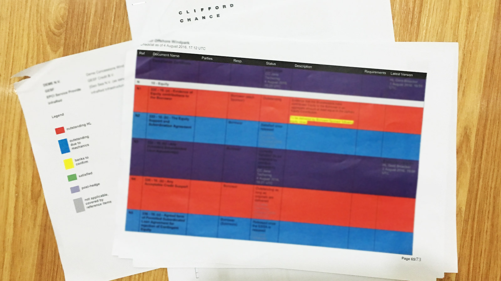
On the recent Clifford Chance pilot, the banks involved were not happy with the fact that the checklist created by Workshare did not include the colour coding, so the lawyers had to run a separate checklist in Word, with colour coding status labels added back in. This indicates that the bankers and lawyers involved in this type of deal are used to working in this way and don’t want to run a deal without it.

Some lawyers will use a sort of traffic light approach (i.e. start with red, progress to amber and then to green). But as shown by Jana’s final checklist on the CC pilot (see image below) they might want to use different colours.

What they are doing to solve this problem until our solution isn’t implemented is to export a printable checklist in Word format and manually create a colour legend and colouring each row of the checklist to indicate the progress of the documents. Here’s an example:

Problem

Discovery

We discussed this feature with Clifford Chance following the pilot. Some of the key points coming out of this were:


  • They feel labels should be controlled by Admins – ordinary members should not be able to set status labels.
  • Setting one status label per document is probably best because it then enables the pie-chart style reporting, which wouldn’t work if there were more than one.
  • It would be very useful to be able to filter documents by status progress and generate an exportable checklist with these.
  • Being able to filter by label and parties would help a lot too. For example: Outstanding documents with Party A on it. (So they know exactly what they need to do).
  • Summary page/tab – “What it is been popular is this summary tab, they just click on that and there is a section which contains the overview of the deal, so they don't have to produce a report.”
  • We need to establish whether changes of status to be shown on the Timeline, email notifications etc, whether there should be a related timestamp shown somewhere.

Sketches

Sketches are always a good way to quickly test ideas without getting attached to your design decisions prior to getting feedback from other people.

Sketch

Prototype

I put together a high fidelity prototype, to test whether the interactions made sense. Things like: where do people go to create a label? Are they able to find the link? Does having a different place to create a label and set up a label make sense to them?

We’ve tested it with 6 users so far, and the responses were very positive.

Metrics

We learned that the best way to evaluate the impact of the UX changes, was by first understanding our goals, so that we could then choose metrics that allowed us measure progress towards our established goals.

The HEART Framework created by Digital Telepathy in collaboration with Google Ventures has helped a lot with that.

Metrics

Want to see more? Here are other case studies.

Access restrictions

Document security first and foremost.

See project

Mobile comments

Communication on the go.

See project